Thursday, October 27, 2011
Graphic Design Oct. 20
Here is a logo I designed that represents the sun. I found this after searching through my older projects. Personally I believe that it has the potential to make a great piece. So in terms of quality what do you think of this project? Should the rays from the sun be spaced evenly or should they be spaced unevenly for a more dramatic look?
This project was done when I could not think of anything in terms of design. I played around with the letters and numbers to see what I can get. This was totally unexpected, but I think it is interesting. The two 2's form a heart while the r's form the boarder. When I look at this I think of a jewelry store on valentines day. I plan on re-working this project in terms of color and neatness because where the 2's converge the lines become jagged and it takes away from the design. If you have any suggestions on what types of colors(what shades or color variations) I could use to improve my design, I'm willing to try anything different?
Thursday, October 13, 2011
Graphic Design Oct. 13
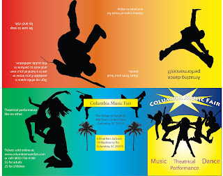
Hello everyone, this is me again. Here I have an event poster mailer. This is the full poster on the inside. As you can see I had problems with the gradient and now that I have looked at it again I can see I had problems with the drop shadow. The drop shadow is an easy fix, but I will need some help with the gradient. If any of you can help solve my gradient issue I would greatly appreciate it.
Here is the reverse side of the poster mailer. I did not have much problems with the gradient on this one, but I could have decorated it a little more. Its hard to know when to take a simple approach on a project or a more complex approach. Any ideas on what direction I should take on this peice will be appreciated.
I have started working in Adobe After Effects, and I realized that I could use some of the frames in the animations to add more effect on my design work. Is there a way for me to convert frames to jpeg or tiff files? If so I would love to hear about it. In the future, if possible post some of my work I have done in After Effects to let everyone see what I have been working on.
Graphic Design Oct. 06
In my package design class we had to design labels for a specific company. I chose FishinChips for my labels. Here is what I came up with. I used Illustrator for this project. My main problem was the color variations of the fish and how they appeared on the background of each label. Any ideas on how to improve these labels will be appreciated.
Here in Digital Illustration I created a speed chart. I am trying to make the chart look more attractive by finding a better font for the title. I will accept all thoughts on what types of fonts will go with my chart without taking away to much attention from the animals.
Here in Digital Illustration I created a speed chart. I am trying to make the chart look more attractive by finding a better font for the title. I will accept all thoughts on what types of fonts will go with my chart without taking away to much attention from the animals.
Subscribe to:
Comments (Atom)


